Friday, May 24, 2013

Are Logos Modern Day Pictographs?

Art and design are deeply informed by and in dialogue with the culture of the time. 

Since the beginning of time, humans have created images to express/make sense of their surroundings.  We can trace Visual Communication back to these early people who ventured out into grassy plains with hands holding objects and the need to communicate through visual methods.  From speech to writing our predecessors used marks, symbols, pictures, and letters drawn/etched upon a surface. 

Cave Painting from Lascaux, 15,000-10,000 BCE
The caves in the Lascaux Region of Northern France/Southern Spain contain volumes of Visual Communication from these early people.  We see this early society creating images of animals, symbols and marks upon these walls.  Although we are not completely sure of the exact meaning of these images we know that the hunt was at the center of survival.  Therefore it is not surprising that the walls are filled with images of these animals.  In some caves we even find images of the now extinct Wooly Mammoth.  


Pictographs Examples

We could define a pictograph as an image that contains an idea.  When we trace the evolution of writing we begin with pictographs.  These pictographs to the left were found carved and painted on rocks in the Western United States.  These types of symbols have been found all over the world. 


Clay Tablet with Sumerian Pictographs. 

Some of the earliest records of writing was with the Sumerians, who lived in Mesopotamia, along the Tigris and Euphrates Rivers.   Archaeologists have traced these early pictographs to what eventually became cuneiform writing.  Here is a breakdown of the pictographs to the left:
The image of the star means Heaven or God. 
The words for Head and Water will evolve from these early pictographs. 


From images of animals, nature, the sun, shapes, water and humans we are given a glimpse into what was important to these early people. 

Modern Day Logos/Symbols
 What do the logos that we are surrounded by tell us about our culture?  We recognize a Target, a Dunkin Donuts, and a Staples often by the logos as we pass by on a bus/car/bike/running sneakers, etc.  What (if anything) do our logos have in common with pictographs?

What is in a logo?  
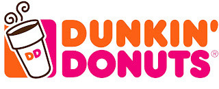
The Dunkin Donuts logo provides us with an example of a Descriptive/Illustrative Logo.  The Cup of coffee describes the product that one would come to DD to purchase.  Like the pictographs above we see the logo expressed through simple, graphic shape.  The image of the coffee cup contains an idea.  We could go as far as describing the swirly marks above as symbolizing the power of caffeine.
 

The Staples logo is primarily typographic. It uses the colors, white and red and the placement and creation of type that we have all come to recognize as Staples.   


The Target Logo is Symbolic.  Although the store, Target has nothing to do with Archery practice we have all come to recognize the imagery of the red target.  Once again we see the logo expressed through the use of simple, graphic shape and limited use of color. 


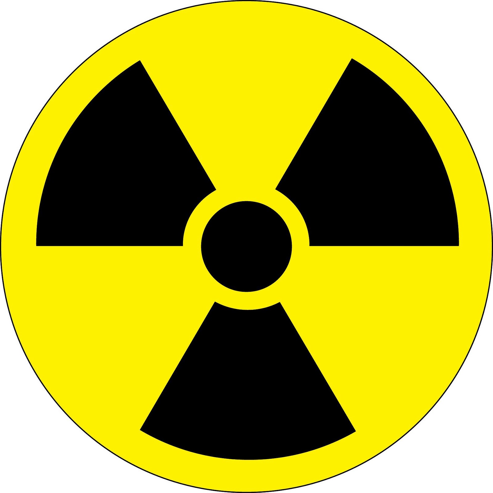
Although we most times refer to the image to the left as a symbol rather than a logo, if we really stop and think about it there is not much a difference between symbols and logos.  The symbol to the left signifies that something is radioactive.  The radioactive symbol is a great example of an abstract symbol.  It depends on the arrangement of simple shape and color to communicate its message.


So, are our logos/symbols modern day pictographs?  I would say, yes.  The logos/symbols that are so much a part of our everyday lives communicate with us visually about danger, a place to picnic, eat or buy office supplies. 

We can divide logos/symbols into the following categories:
Typographic: Typographic symbols/logos rely heavily on type to express an idea.

Illustrative/Descriptive:  An Illustrative/Descriptive logo/symbol contains imagery that is recognizable and relates directly to the service being provided and/or the idea being communicated. 

Symbolic:  A Symbolic logo contains symbolism.  It can use literal and/or abstract imagery. 

Abstract:  An abstract logo/symbol uses abstraction to represent the idea. 


Thursday, May 23, 2013

The Shape Builder Tool in Illustrator

The Shape Builder Tool is a great tool to create, edit, combine and dissect your Illustrator Objects (shapes) in a more organic way.  The Shape Builder Tool shares many similarities to the Pathfinder Window.

So what are the differences?  The Shape Builder Tool provides you (the designer/art student/Illustrator Experimenter) with the opportunity to work and create a workflow that will feel more natural than the Pathfinder Window.  The Shape Builder Tool provides the opportunity to push the what was/is possible with the Pathfinder Window further.  (If you are not sure what the Pathfinder Window is read my blog on the Pathfinder Window.)

Let's Experiment! 

Where is the Shape Builder Tool?
Shape Builder Tool

Shape Builder Tool Fly Out


As you can see from these images the Shape Builder Tool has a Fly Out Menu associated with it.  Therefore if you do not see the Shape Builder Symbol on the Tool Bar select from the Fly Out menu above. 


1.  Create the Objects that you would like to work with on your ArtBoard in Illustrator.  Make sure that the Objects that you will be working with are active.  When an Object is active it is selected.  We always know that an Object is selected when we see its anchor points and paths as shown below. 
Two Overlapping Active Objects
2.  Working with the Shape Builder Tool hover over the Objects and Click as shown in the three below images.  
Image 1

Image 2

Image 3
 3.  Through hovering and clicking the above Objects/Shapes we have created three separate Objects.  Now working with Selection Tool (Black Arrow) and Direct Select Tool (White Arrow),
we can move these shapes/objects independently as shown below in Images 1b-3b:
Image 1b

Image 2b

Image 3b


4.  Here is another example of steps to follow to work with overlapping objects with the Shape Builder Tool.  In the above example I showed you how to Divide a group of Overlapping Objects/Shape.  In the below example we will exclude the overlapping sections.

Overview and Steps for working with the below shapes:  
1C- Make sure all Object are selected.
2C-5C - With Shape Builder Tool, click all areas where the shapes overlap.
6C- Deselect
7C- 10C working with the Selection Tool or Direct Select Tool select the overlapping shapes and delete.
11C- Final Result.  
Image 1C

Image 2C

Image 3C

Image 4C

Image 5C

Image 6C

Image 7C

Image 8C

Image 9C

Image 10C

Image 11C


Here is a video to help with the Shape Builder Tool:

The Pathfinder Window in Illustrator

An Overview of the Pathfinder Window
The Pathfinder Window in Illustrator provides a great way to create and dissect new interesting shapes.  


In order to open and experiment with the Pathfinder window follow the below steps:

1. Window > Pathfinder

Pathfinder Window


(The Pathfinder Window contains a series of commands that can be applied to your shapes in Illustrator.  The best thing to do is to create your shapes and experiment! As you hover your mouse around this window the commands will appear.)


2.  Select and draw two overlapping shapes.  Use the Shape Tool on the Tools Panel.
Shape Tools

2 Overlapping Shapes
3.  Make sure that both Shapes are selected and then choose one of the pictures on the Pathfinder Window.
Selected Shapes


(In Illustrator an Object is selected if you can see its anchor points and paths.  In order to select multiple shapes use you black arrow, the Selection Tool, and hold down Shift.)


1. Unite
2. Minus Front
3. Intersect


4. Exclude


 Examples 1-4 are the first row of commands on the Pathfinder window.  They specify Shape Modes. 


5.  Divide

6. Trim
7. Merge

8.  Crop


9. Outline

10. Minus Back


Examples 5-10 are from the 2nd row of the Pathfinder Window, located in the Pathfinders section.  


The Pathfinder Window has great tools to use for designing logos, creating interesting patterns and so much more.

Wednesday, August 29, 2012

The Principles of Design

In the last post we discussed the elements of design.  Now we are going to look at how these elements relate to the principles of design.

The elements of design (line, shape, color, texture and value) are the building blocks of all visual art and design.  The Principles of Design are how we arrange and/or organize these elements. 

These principles are:

rhythm-  Often the term rhythm is used to describe visual art and design.  A Visual Rhythm can be created in a variety of ways.  Often this is done through repetition and the type of lines, shapes and colors that are used.  balance-  Balance refers to how the elements within a composition are organized.  Here we often think about Symmetrical Balance and Approximate Symmetry.    harmony/ unity- All of the elements of a design relate and complement one another.  dominance/ emphasis-  Both Dominance and Emphasis show a certain element within a composition having more visual weight.  We can think about this as a sense of Visual Hierarchy.    variety- We can say that variety is often what makes a design interesting.  Variety presents differences between the elements that appear in a composition.  For instance when we look at a composition based on repetition, often there are additional elements that break up the repetition to create visual interest.  scale/proportion- Scale often refers to the sizes of the elements that are found within a composition.  Scale and Proportion refers to how the sizes of the elements within a composition relate to one another.  direction- When we see the principle of direction, we see the elements being used to create a visual direction within a composition. 
repetition- We see repetition quite often in pattern design.  In Repetition an element in a composition is repeated.  

  What principles do you see at work in this photograph?   We see repetition, in the repeating green leaves.  We see direction in the organic green shapes, visually leading our eyes through the composition.  The brown part of this plant presents variety in this composition. 


In the next photograph we see the use of type against a painted brown brick background.  The order of the type presents a sense of balance.  The use of color create a visual sense of harmony and unity.  Maybe we could say that the numbers, 1609 dominate this composition, creating emphasis.  


In this piece we clearly see repetition.  Variety of shape is found in this composition to create a sense of visual interest.  We see the shape of metal heater being the dominate shape at work. 


What elements do you see at work in the next image?  Quite often we see all of the principles working in one way or another. 

Monday, August 27, 2012

The Elements of Design

The Elements and Principles of Design are the foundation of the study of Art and Design.  They are the building blocks of all Art and Design.  The Elements and Principles of Design provide us with the vocabulary to begin to discuss, explore and create strong Visual Art.

Let's begin with the Elements of Design.

In 2-Dimensional Design the elements of design are:
LINE, SHAPE, COLOR, TEXTURE AND VALUE

Line:  A form that connects dots.  A line becomes visible due to the contrast between the form and its surrounding area.  In Visual Art a line is often the most basic element.  Many pieces of art begin with one line.  A line can be drawn, brushed, erased, carved...  The possiblities of line are endless!

A line is a dot that went for a walk. - Paul Klee

Shape:  A shape is an enclosed defined space.  Quite often when we think of shape we think of geometric shapes such as circles, squares, rectangles and/or squares.  Shapes are not limited to these definable forms though and have infinite possibilities.
 
The object of art is to give life a shape. - Shakespeare

Color:  is the part of light that is reflected by the object that we see.  We can not address Color in Art and Design without looking to Color Theory.  Color Theory is a vast topic with a great deal of information.  The basic pieces of Color Theory are the Color Wheel, Color Context and Color Harmony.  

Texture:  is the tactile surface quality of an object.  Some examples would be soft, fluffy, rough, and wet.  Texture can be actual or visual. 

Value:  refers to the range from lightness to darkness. 
    
As we view Visual Art and Design we find these elements being used in a variety of ways.  Below are three examples of the Elements of Design/ The Visual Elements at work.

Sol LeWitt, Wall Drawing

In this example by Sol LeWitt the dominant element at work is line. We see organic line moving through the composition.  The contrast between black and white create a strong figure/ground relationship.  We can say that this example shows us line simplified.  A thick black line curves around, filling the space.


Alice Neel, Marisol. Oil on Canvas, 1981


In the next painting by Alice Neel, Marisol, we see all the visual elements at work, pointing out how beautifully the Visual Elements work together.  When we compare this piece by Alice Neel with the Wall Drawing by Sol LeWitt we can surmise that the portrait uses the elements in a more complicated way.  Maybe we need to look a little closer to see these elements at work.  We see the lines of the chair.  The lines of the sweater tell us a great deal about the anatomy of the woman.  We see the lines that define her facial structure, hair, hands and pants.  We see the color that defines her skintones, hair, clothes and surroundings.  When we look closely we see warm and cool colors as highlights and shadows.  We see the juxtaposition of her blue pants against a brown-orange chair.  Throughout this painting we see value at work in the highlights, shadows and midtones.  Underlying this painting are the shapes.  We see the shape of the negative spaces around Marisol.  We see the shape of her pants, the shapes of the shadows on her pants, the shapes of her fingers, hands, sweater, hair, eyes, nose and more!  In this piece we see the visual texture of her hair, skin, clothes and the chair that she sits upon.  

Milton Glaser, Bob Dylan Poster. 1967


In the Bob Dylan Poster by Milton Glaser we see the elements of design at work again.  

The use of color, line and shape work beautifully throughout this composition.  Dylan's hair is treated in a stylized manner, showing the hair as a simplified visual form with exaggerated color and shape.  We see this portrait of Dylan with flat shape and color, the black silhouette, colorful shapes with contour line, the white empty space and use of type.  The dominant elements at work in this piece would be shape and color.  Yet we do see the use of line and in the type as well as the contour lines surrounding the shape of Dylan's hair.  Value is at work in the contrast between black and white as well as the contrast and inherent value that the colors present.        


To understand and create Visual Art and Design we see and use the elements of design.  Line, Shape, Color, Texture and Value are the building blocks of Visual Art.  As we look around we see these elements at work in complicated and simple ways.   

Wednesday, August 15, 2012

So, What exactly is a vector?


So, What exactly is a vector?????
It is one thing to read about the differences between Vector and Raster Art but true clarity comes when we see these differences.

To re-cap from my earlier post a vector drawing can be described as a clean, visual composition that can be scaled without losing resolution.  Vector art is great for creating wireframes, logos, icons, complex shapes, setting type and so much more.

Illustrator is Adobe's Vector Drawing software that integrates beautifully with Adobe's other Programs (Photoshop, InDesign, Flash, AfterEffects, etc). 

Whereas Illustrator is a Vector based program, Adobe Photoshop is raster imaging software.  When working with raster images we are limited by pixels and resolution.  We constantly have to watch the DPI (dots per inch) or the PPI (Pixels Per Inch) settings .  There are places where raster imaging is exactly what we want.  Pixels are perfect for photos.  A concentration of colored pixels is what creates a digital photograph. 
(One thing to keep in mind is that sometimes you will have to take a vector image and turn it into a raster if you are taking that image to the web, a mobile device or an e-tablet.)  

Now let's look at some examples!
Example 1: Vector Logo on Left, Raster Logo on Right

In the above example, Example 1, we see a Vector Graphic on the Left and a Raster Graphic on the right.  Upon first glance the two images don't look much different.  Now let's zoom in to see the differences!


Example 2:  Zoomed in Raster Image
In Example 2 the differences become clear.  Our raster image is based on pixels.  When we zoom in we see these pixels.

So, when we work with our raster images we have to continually watch the resolution.  The more pixels an image has the higher the resolution.  The higher the resolution the larger the file.

When working with raster images if we are going to print the image we usually work at a higher resolution.  This resolution is often set to 300 ppi (pixels per inch).   When we are preparing an image to be used on the web we often work at a lower resolution such as 72 ppi (pixels per inch).  One of the reasons why we work at a lower resolution when we are preparing an image for the web is so the file size is smaller and will not slow down the person's internet connection as he or she waits for it to download.


Example 3: Zoomed in Vector Image


In Example 3 we see what happens when we zoom in on our Vector Image.  This graphic is not based on pixels.  Instead, underlying the shapes, colors, and type are mathematical equations, making this graphic resolution independent.

We could describe the edges of this image as being crisp and clear.